1. What is Wavefront
Wavefront("WF") is referred as the dashboard where we could monitor metrics of our services.
Tanzu Observability by Wavefront is a high-performance streaming analytics platform that supports observability for metrics, counters, histograms, and traces/spans. The product is unique because it scales to very high data ingestion rates and query loads. You can collect data from many services and sources across your entire application stack, and can look at details for earlier data that were ingested earlier.
2. How Do I Read It
I will only introduce how to read dashboard since we are doing migration, how to build a chart(dashboard) will not be covered in this article.
2.1 Explore
By default, the dashboard shows live data.
| 1. To change the time window, click the time selector and select, for example, Last 12 hours. All charts in the dashboard are updated to the new time window. |  |
| 2. Notice the options below the time selector, and select Jump To > Processes to show the Processes section. Below the time selector, you see: The lock icon, which shows that you cannot save this system dashboard.The Favorite (star) icon, which you click to make this a favorite dashboard.The Jump To menu.The Filter field. |  |
3. To filter data, type az = us-west-2 in the filter field. All charts in the dashboard are updated to show only data from the us-west-2 availability zone. When you select one filter, other filters become available below. Explore how you could also set the environment to production, dev, or both. |
 |
| 4. Finally, explore time selection and time sync across charts.Drag-select a short time window on one of the charts, for example Latency Statistics to zoom in. Click Sync Time to update all charts in the dashboard.Click Reset to undo. |  |
2.2 Drill Down Into Charts
To edit dashboards and charts, you need Dashboards permission.
| 1. Let's start with viewing events for system alerts.In the Latency by AZ Test chart, hover over one of the dots at the bottom. Each dot represents an event.Examine one or two events more closely. The events in this sample dashboard are system events that are triggered by alerts. |  |
| 2. Move to the right and explore changing the time window. 3. Next, select Edit from the ellipsis menu. You can instead click the name of the chart to put it in edit mode. |
 |
| 4. Select the chart type drop-down, which shows Line Plot initially, and select Stacked Area. If the filter is still set to us-west-2, consider removing it for a more interesting chart. |  |
| 5. Next, explore the chart options to examine how you can adjust the view of your data. Each chart type has chart-specific options. See Chart Reference for details. 6. Finally, click Back to return to the dashboard to continue exploring. Because this Tour dashboard is a system dashboard, you cannot save changes even if you have Dashboards permissions. Clone the dashboard if you want to make a copy and save changes there. |
 |
2.3 Functions
In our dashboards, there functions are must-know, please refer to the dodument carefully and find their usage for better migration.
- ts(): Returns the time series that match the specified metric name, optionally filtered by sources and point tags. Use
ts()to display the time series in a time-series chart, or to specify the series to other functions. - ratediff(): Returns the differences between adjacent values in each time series described by the expression. The results include only positive changes in value. Use
rate()if you want to see per-second rates of change. - align(): You can use
align()with time series and with histograms.- Time series function: Groups the data values of a time series into buckets of size timeWindow, and returns one displayed value per bucket. Each returned value is the result of combining the data values in a bucket using the specified summarization method.
- Histogram function: Groups the distributions of a histogram series into time buckets of size timeWindow, and returns a single merged histogram distribution per bucket. In a time-series chart,
align()displays just the median values of the resulting distributions.
- rawsum(): Returns the raw sum of the set of time series described by the expression. The results are computed from real reported data values only. Use
sum()to include interpolated values. - msum(): Returns the moving sum of each time series over the specified time window.
For more functions, please refer the official docs for usage.
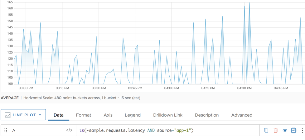
2.4 Example
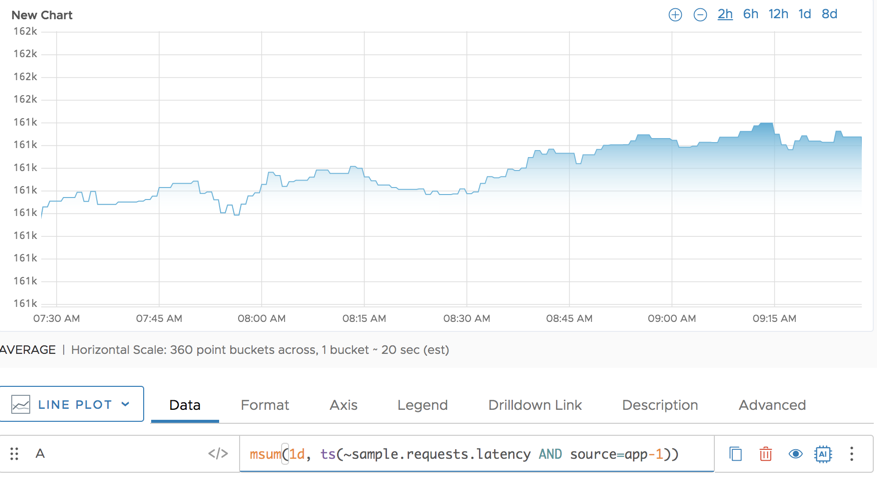
Here, this query shows us the msum of each day(the parameter1d) of the metric(or data source) ~sample.request.latency where the column source-app-1.